Redesign: Colors
The site has been running on VBOX for a few days now and so far so good. I’ve configured backups and automatic updating of the Enom DNS server in case my IP changes. To get rid of the noise from the server, I disabled the enclosure fan. The temperature increased by around 15 degrees centigrade, but it’s still well below the maximum operating temperature of the CPU. The only noise I hear now is the occasional rattling from the hard drives. Right now there are only two things left to do. I don’t have any backup hardware, so if the CPU or the RAM chips suddenly fail, I’m looking at some serious downtime. Also, should my apartment burn to the ground, I’d loose all the data. So what I need to do is to buy some spare hardware and set up the backup to upload to an external site, like Amazon S3.
But with the bulk of the server related work out of the way, I can now use some of my spare time on my next endeavor: The site redesign. I’m going to take it step by step, but I’m not sure where to start. I know nothing at all about web site design, and although I was involved in the technical implementation of the new nrk.no design, I never had the chance to take part in the visual design and interaction design processes. I could of course start by reading tons of articles about best practices in web design on the internet, and maybe even buy a book or two, but since I’d like to actually finish the design before 20121, that’s not an option.
So I’ve decided to start with the colors. All my previous designs have used colors quite sparsely. The main reason for this is that I don’t know anything about color theory, what colors work together, what colors should be used for what and how to mix and match them. Luckily, I do know what colors I like and the internet is full of people who knows how to make them work together. COLOURlovers is one of the many sites where people who know and love colors come together and it was a perfect place for me to start. I surfed around for about an hour and collected six palettes I liked. For once, I’d recommend that you don’t use the Opera browser while looking at the palettes below, at least in OS X. It looks like Opera somehow messes up the gamma correction. Shame on you, Opera!


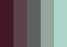
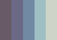
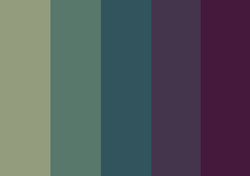

The palettes are, from left to right, top to bottom: Giant Goldfish, i demand a pancake, komix, morning serenity, once so strong and The Bitter Tears.
To be honest, I find the thought of using more than two, maybe three colors a bit disturbing. It will be hard to get them to play together, and if you look at the more popular sites on the internet, do they really use that many colors? Still, I think I’m up for a few challenges during the design process and the first one is to eliminate all but one of the palettes above.
Once so strong (lower right) is the first to go. I think it’s too dark. Let’s try to go for lighter, happier colors. That probably also rules out Komix (center left), even if it’s a bit lighter. The red in The Bitter Tears (bottom right) is too red for me. I could of course modify it a bit, but that might interfere with the rest of the palette and I’m not prepared to go totally nuts with the colors.
That leaves us with the two in the top row and Morning Serenity (center right). Now, the goal of this entry was to narrow the choice of palettes down to a single one and use that, but I need to be somewhere in 45 minutes, so that means I have to stop writing now.
More later.
That way you can enjoy it for a while before the world ends. ↩︎
Feedback
This post has no feedback yet.
Do you have any thoughts you want to share? A question, maybe? Or is something in this post just plainly wrong? Then please send an e-mail to vegard at vegard dot net with your input. You can also use any of the other points of contact listed on the About page.
