Redesign: Final Font Frenzy
Since the last time we “spoke” I’ve been digging my way further down the web typography hole. My plan to use a serif font for the headlines and a sans-serif font for the rest of the text seems like the sane thing to do, confirmed by two facts:
The first is something you see yourself every day. Have a look at any
site on the interweb, any site (except Engadget after their recent redesign), and you’ll see that they use a sans-serif typeface for the main bulk of the text. Open any book, however, and you’ll see that they use a sans typeface for the text. Pretty weird, eh?
You’d think that the same typefaces that work well on print would also work on a computer screen. But then again, no. According to this rather non-scientific survey, people just prefer sans-serif typefaces when they read text on a computer monitor because of the increased readability.
Based on this, I set out on a search for a set of free typefaces with an acceptable amount of glyphs that could be distributed using the @font-face CSS property without any restrictions. I browsed through tons of free typefaces on various sites until I stumbled across a high quality typeface on Font Squirrel that Ascender Corporation created for the Android platform. It has both serif, sans-serif and even a mono font that can be used whenever I need that. Here’s a preview:
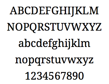
Droid Serif
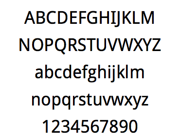
Droid Sans
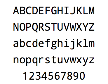
Droid Sans Mono
I’m not sure about the license for this typeface, though. The packaged TFF version is distributed with an Apache license, while the TFF files themselves contain metadata with a much more restrictive license. Knowing the Android platform, however, I sticking to the Apache license.
A very nice feature of Font Squirrel is that they provide versions of all their typefaces that will work on all the major browsers as a kit, complete with sample CSS and HTML.
We’ll see how well these fonts will actually work, though. If they don’t work at all, changing them to something well known and safe is not much work, thanks to the magic of CSS.
There you go, both the color palette and the typefaces have been decided (sort of). Next up; layout.
Feedback
This post has no feedback yet.
Do you have any thoughts you want to share? A question, maybe? Or is something in this post just plainly wrong? Then please send an e-mail to vegard at vegard dot net with your input. You can also use any of the other points of contact listed on the About page.
