Redesign: Layout and Eye Candy
Now that I have settled with colors and fonts, one last thing is left before I can start with the implementation of the design: How should the site look in terms of layout and various eye candy? Rounded corners come to mind. I got to have rounded corners, right?
The best place to find inspiration is on the internet, because there are a lot of very nice site designs out there. Another source of inspiration might even be my own previous designs. While looking for some old pictures today, I stumbled across this one:
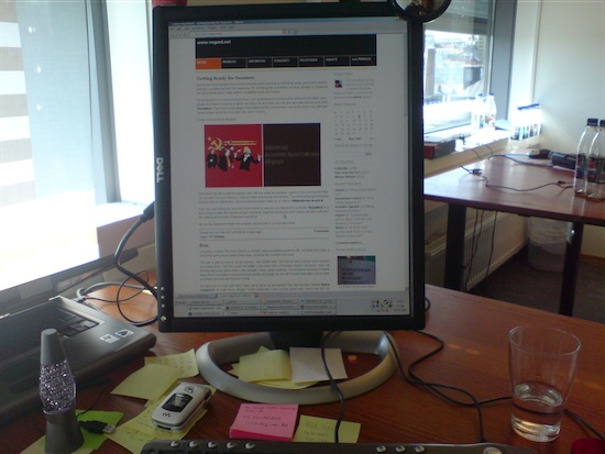
It’s taken at work in May 2007. Why I took the picture, I don’t know, I’m guessing it wasn’t long after another redesign of the site. Please don’t mind the mess on the desk, the incoherent ramblings on the post-it notes and the fact that I have Steam installed on my work computer. Have a look at the design. The first thing that hit me was “that’s a nice design, I like it. It’s clean and pleasant to look at”. However, since I made it myself, it’s probably not too surprising that I like it. One of the elements I really miss in the current design is the calendar widget on the sidebar. The one on the picture was one I made myself for my own, homegrown CMS, but I’m sure someone has made a similar, and most likely better, widget for WordPress.
One of the layout related changes I’ve decided to do is to make the site wider. I will keep the width static, but make it fit 1024x768 screens. Today’s design is aimed at 800x600 screens, but only a mere 2% of my visitors use this screen resolution. The rest either has a higher screen resolution or they are visiting on a mobile device. The latter will not be an issue as they’ll get the WPtouch version of the site anyway. WPtouch is a great plugin, by the way, if you run a WordPress site and want to make it accessible for mobile devices, WPtouch is the way to make it happen. Making the site wider means that I can make both the main section and the sidebar wider. I’ve often wanted to make the sidebar wider, but it would make the main section too narrow. With more space to play around with, that won’t be a problem anymore.
Then on to the inspiration. A quick search in Google for “web design inspiration” shows that there are no lack of places to go to find some. The problem, however, is that most of the designs showcased require a Master’s degree in visual design and ten years worth of PhotoShop experience, and I have neither. Because of that I have to stick to minimalistic design, but to be honest, that’s the style I prefer anyway. With a new search for “minimalist web design inspiration” I found designs more suited for my skills.
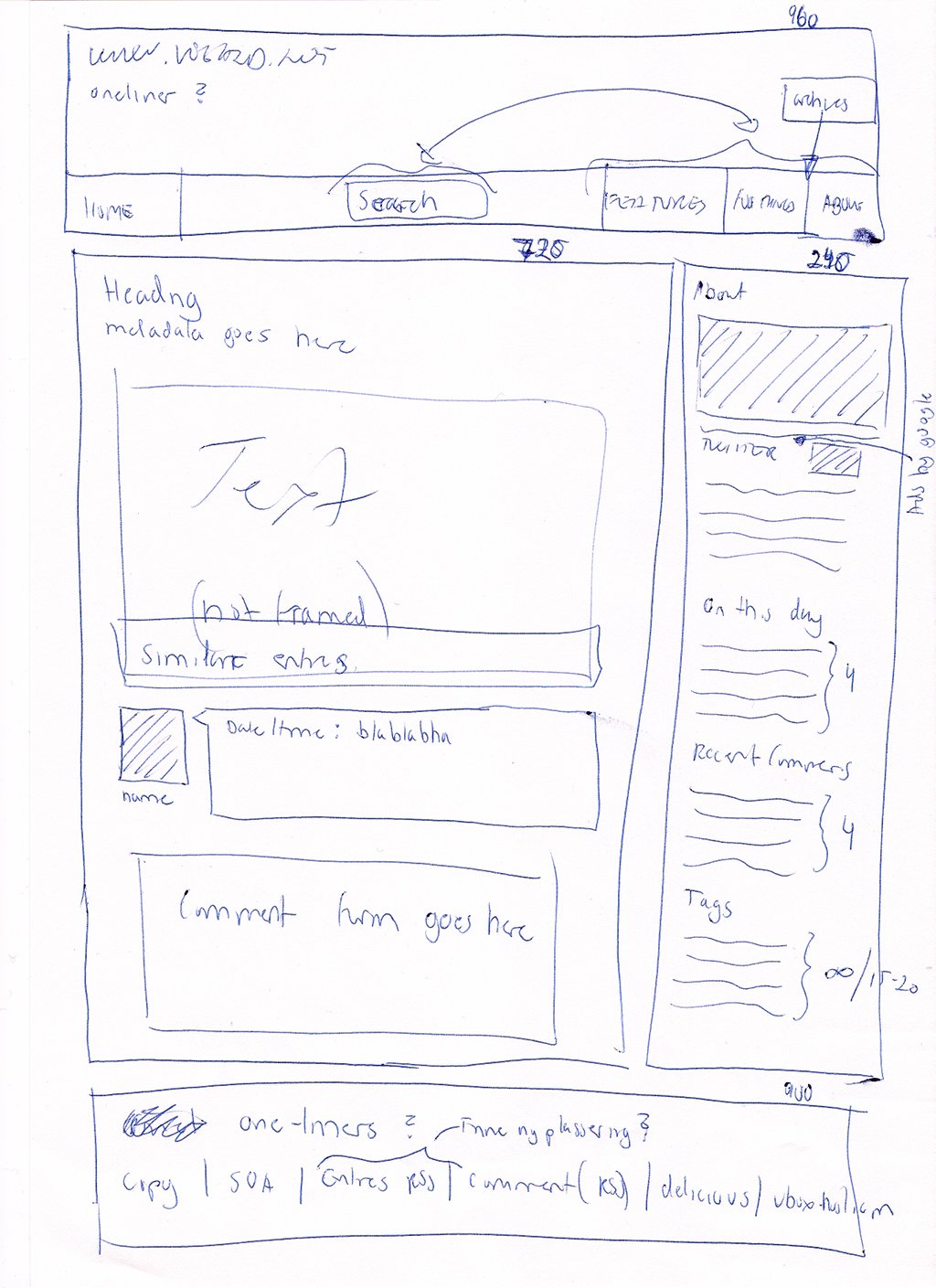
In the process I found minimalsites, a site dedicated to showcasing minimalist web site designs. It features a lot of designs, most of them with white or a very light colored background. A slight kick in the nuts, perhaps, since I’ve decided to go with a little bit of color this time. But I’m sure it’s possibly to make a simple design with colors as well. Another thing I noticed was that nearly every site use a grid model for their layout. This makes the site look nice and tidy and I will probably do the same by using the 960 Grid System, which is well-suited for my needs. A few clicks and I’ve got the HTML and CSS I need for the basic layout. Great.
I also learned once that pen and paper is just as good as a computer to get the creative process started, so I quickly drew a sketch of a possible layout. It’s a marvelous mix of English and Norwegian notes and doesn’t look too different from the current layout. That’s because I will most likely not change the layout too much; it’s a tried and tested model that works.
So there you have it. I’m taking baby steps, but I’m getting there. This will be the last entry describing the broader parts of the site redesign. From now on I will focus on the details, like header, footer, sidebar, comments and things like that.
Feedback
This post has no feedback yet.
Do you have any thoughts you want to share? A question, maybe? Or is something in this post just plainly wrong? Then please send an e-mail to vegard at vegard dot net with your input. You can also use any of the other points of contact listed on the About page.
